25 Experts have compiled this list of Best Data Visualization Course, Tutorial, Training, Class, and Certification available online for 2020. It includes both paid and free resources to help you learn Data Visualization and these courses are suitable for beginners, intermediate learners as well as experts.
9 Best Data Visualization Courses, Certification & Training Online [2020 UPDATED]
1. Data Visualization Degrees & Certificates Online (Coursera)
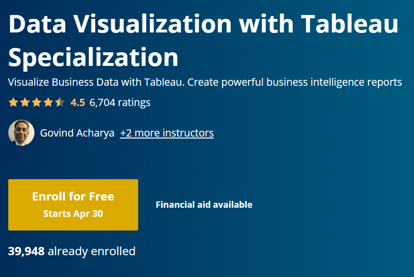
It is a fact that data visualization is indeed one of the fastest-growing field in today’s world. Coursera brings to you a series of over 100 certifications and classes to help you enhance your skills in this area irrespective of your current expertise level. You can go for mastering the famous tools such as Tableau, visualization with python, advanced excel and more. Choose from the options that suit your requirements and integrate the concepts and apply them in a real-world project. If you are interested, do have a look at some of the best Tableau Courses available online.
Key USPs –
– Navigate the tools and software to solve real-life challenges.
– Understand the fundamentals and attempt the accompanying quizzes to measure your grasp on the topics covered.
– A wide variety of examples and demonstrations help you to get a clearer view of the topics.
– Use the data gained from different sources to evaluate strategic alternatives and draw insights.
– The flexible deadline allows you to learn at your convenience.
Duration: Self-paced
Rating: 4.6 out of 5
You can Sign up Here
2. Data Visualization Courses (Udemy)
Statistics is indeed quite important but it is also important to understand the meaning behind the datasets and keep your organization one step ahead. To help you with that Udemy has an array of options to use your data efficiently and gain insight from it. Use the filter available on the website to choose the one that is perfect for you. Some of the bestsellers include Excel chart and graphs, motion graphics, Python for data analysis, mastering D3.js and Tableau expert.
Key USPs-
– The beginner level courses do not need any prerequisite to get started.
– Create graphs, charts, dashboards and more that help you to represent the data in a user-friendly manner.
– Gain the best practices, tips, and tricks based on the experience of the instructors.
– The topics are covered at a pace that can be swiftly followed by the students.
– Lectures + Articles + Downloadable resources + Full lifetime access
Duration: Self-paced
Rating: 4.5 out of 5
You can Sign up Here
3. Free Data Visualization Courses (edX)
If you are interested in jump-starting a career in data visualization and analysis then this platform is worth a look. There are professional certificates, micromasters programs as well as individual programs. Commence by building a solid foundation with programs such as essential statistics for data analysis and its use on social science, introduction to R for Data Science following which you can go for more advanced choices like business and data analysis skills, statistical thinking and more. If interested, you can also check out our compilation of Data Science Certification.
Key USPs-
– Apply methods, tools, and software for accessing and managing structured and unstructured data and derive information from them.
– The complete set of lessons are broken into appropriate sections which makes it easy for the students to follow.
– Learn to use the different features and use them appropriately to create the visual representation of data.
– Earn certifications from the leading schools of the world and learn from industry experts and academic professionals.
– Work on practical assignments and projects to enhance your portfolio and implement the topics covered in the videos.
Duration: Self-paced
Rating: 4.5 out of 5
You can Sign up Here
4. Data Visualization – Nanodegree Certification (Udacity)
If you are aware of the basic data analysis techniques and are looking forward to building upon that then this program will help you with that. Begin by learning to select the most appropriate data visualization for analysis and evaluate its effectiveness. Following this, you will get started with building interactive Tableau dashboards based on the user needs and required metrics. By the end of the classes you will become efficient in telling an interactive story using your data and providing recommendations based on it.
Key USPs-
– Define an effective problem statement, structure a data presentation, scope analyses, identify biases in your data.
– Understand the limitations within your datasets and create the dashboards accordingly.
– Use storypoint to add interactivity and visual elements to a story.
– Add animation and narration with Tableau Pages and Flourish.
– The one on one mentor will guide you throughout the journey and answer your doubts.
Duration: 4 months, 10 hours per week
Rating: 4.5 out of 5
You can Sign up Here
5. Data Visualization in Python (Codecademy)
Codecademy provides a special Data Visualization course in Python that teaches you how to present data with Python, Matplotlib, and Seaborn. This course first talks about why you should learn data visualization and how it can be beneficial for you. In this course, you’ll learn how to grasp difficult concepts or identify new trends, how to make an argument and explore your thinking in different ways with the help of Data Visualization. Apart from Python, you will also get introduced to Matplotlib and Seaborn that make it easier for users to create visualizations easily and quickly. Check out our compilation of Best Python Data Visualization Courses.
Key USPs –
– A very effective and knowledgeable Data Visualization course available online for all individuals
– Know about different graphing tools that are used in Python for data visualization
– Learn how to create graphs, bar charts, pie graphs, and many other aspects of Matplotlib
– Understand Seaborn that works as an add-on to Matplotlib for styling graphs more professionally and creating sleeker graphics
– Learn how to choose color schemes for your figures and take them to the next level
– Get quizzes and practice exercises to stretch your knowledge and skills
– Create portfolio projects at the end of the course to showcase your skills
Duration: 6 hours
Rating: 4.6 out of 5
You can Sign up Here
6. Free Data Visualization Courses (LinkedIn Learning – Lynda)
LinkedIn has compiled a list of over 150 training and programs that will help you to stay ahead with expert-led classes. The pieces of training are mostly divided based on the level of difficulty and prerequisites required. Beginners can take the essential programs, best practices, tips, and tricks, picking the right chart for your data that will cover the fundamentals and the dos and don’ts following which the intermediate and advanced level courses can be attempted. Some of the popular options for experienced learners include visualizing geospatial data with Power Map in Excel, creating projects for interactive data visualization with processing, and infographics – visualizing relationships.
Key USPs-
– The lectures use real-life based datasets from publically available sources which creates a realistic environment to approach the challenges.
– Guidance is provided to perform all the necessary installations and configurations.
– The lessons are explained in detail which helps the students to learn easily.
– Learn to apply fundamental analytics and present information to non-technical individuals.
– Plenty of assignments to practice the concepts covered in the lectures.
– The content and videos are available for free for the first month after signing up.
– The exercises and videos are available for offline use.
Duration: Self-paced
Rating: 4.5 out of 5
You can Sign up Here
7. Big Data: Data Visualization (Future Learn)
In this comprehensive class, you will get acquainted with the methods, process, and tools involved in bridging the gap between data and decisions. Get introduced the history of this field, visualization, tools, design approaches and different techniques to visualize the data. By the end of the course, you will be able to explore big data frameworks and demonstrate an integrated approach towards it. Do also have a look at our compilation of big data courses.
Key USPs-
– The lessons can be taken by individuals from different fields who are interested in understanding the real world big data problems.
– No prior experience is required with using Tableau, MATLAB Online, D3.js but some knowledge of computer programming can be beneficial.
– Develop an awareness of how to participate effectively in a team working with big data experts.
– Create data models using the various tools to gain useful information from them and reach crucial decisions.
– Gain a deeper understanding of the analysis process and discuss the methodologies for the efficient use of digital data.
Duration: 3 weeks, 2 hours per week
Rating: 4.5 out of 5
You can Sign up Here
8. How to Process, Analyze and Visualize Data (MIT Open Courseware)
This program presents lectures that help you to get started with you with data cleansing, analysis, and visualization. The instructor will guide you through the basics of data analysis through concrete examples. Take raw data, extract meaningful information, used statistical tools and represent it visually for better understanding. Upon the completion of the classes, you will be ready to go freelance or apply for relevant profiles.
Key USPs-
– The demonstrations and examples will help you to build a solid fundamental understanding.
– Work on the assignments that follow the lectures to understand your weak points and work n it.
– Understand how to navigate the tools and understand the necessary aspects.
– The instructors cover the topics at a pace that can be swiftly followed by the students.
– Pass the assessments and earn the completion certificate.
– Suggestion of resources and lecture notes are provided that can supplement the learning experience.
Duration: 4 weeks
Rating: 4.4 out of 5
You can Sign up Here
9. Free Data Visualization Classes (Skillshare)
If you want to master a particular skill, learn to visualize your data in a short time then Skillshare is the choice for you. Consisting of many concise lectures the tutorials are created in such a way that you can immediately apply the knowledge gained by getting hands on. From data to design, customizing charts for beauty and impact, drawing data to communicate ideas and a coding toolkit for visualizing data these are some of the interesting and useful options available on the website.
Key USPs-
– Lessons are concise and get straight to the point.
– Perform interactive data visualization using D3.js.
– Work on the class projects with datasets and apply the concepts to real-life scenarios.
– Design a dashboard, create calculated fields, build graphs and lay them on an insightful dashboard.
Duration: Self-paced
Rating: 4.6 out of 5
You can Sign up Here
So these were the 9 Best Data Visualization Tutorial, Class, Course, Training & Certification available online for 2020. Hope you found what you were looking for. Wish you a Happy Learning!